Another project I decided to participate in was Liam's final film - " The Autumn bridge ", which from what I have gathered from the script and storyboards, portrays a "Revenge of the Sith" like duel between 2 knights. My role for this remains the same from when I was with Chloe - being the main background artist, and in charge of everything from the castle's design to the colour pallete for the animation and everything in between. What sets this apart from Chloe's though, is the sheer quality that these background needs, as it involves lots of large, cinematic shots, that contain complex elements such as the sky, mountain ranges, water bodies, ( all of which need a certain level of detail to capture the more moody and serious tones of the animation ). With that said, we started the process in the same manners as Chloe - building a 3D layout world for Liam to capture his storyboard frame from. Having experienced the ease that came with having a 3D render laid out for you to colour on top from doing Chloe's background, I was very much inclined to replicate the same effect with Liam's. And so, the first couple of days was just waiting for him to finish with that, as well as adjusting the storyboard themselves in a way that we can res-use some complex assets in multiple shot (this will be highlighted better down below).

Following that, the next challenge was designing the castle. I was very much interested in the rounded shapes of the 3D form that Liam had made for the layout, but it definitely calls for a bit more variety and texture to make it more "intimidating" and "grand" , as a castle should be. For that , I found major influences in popular fantasy castle designs that have a similar construction namely :
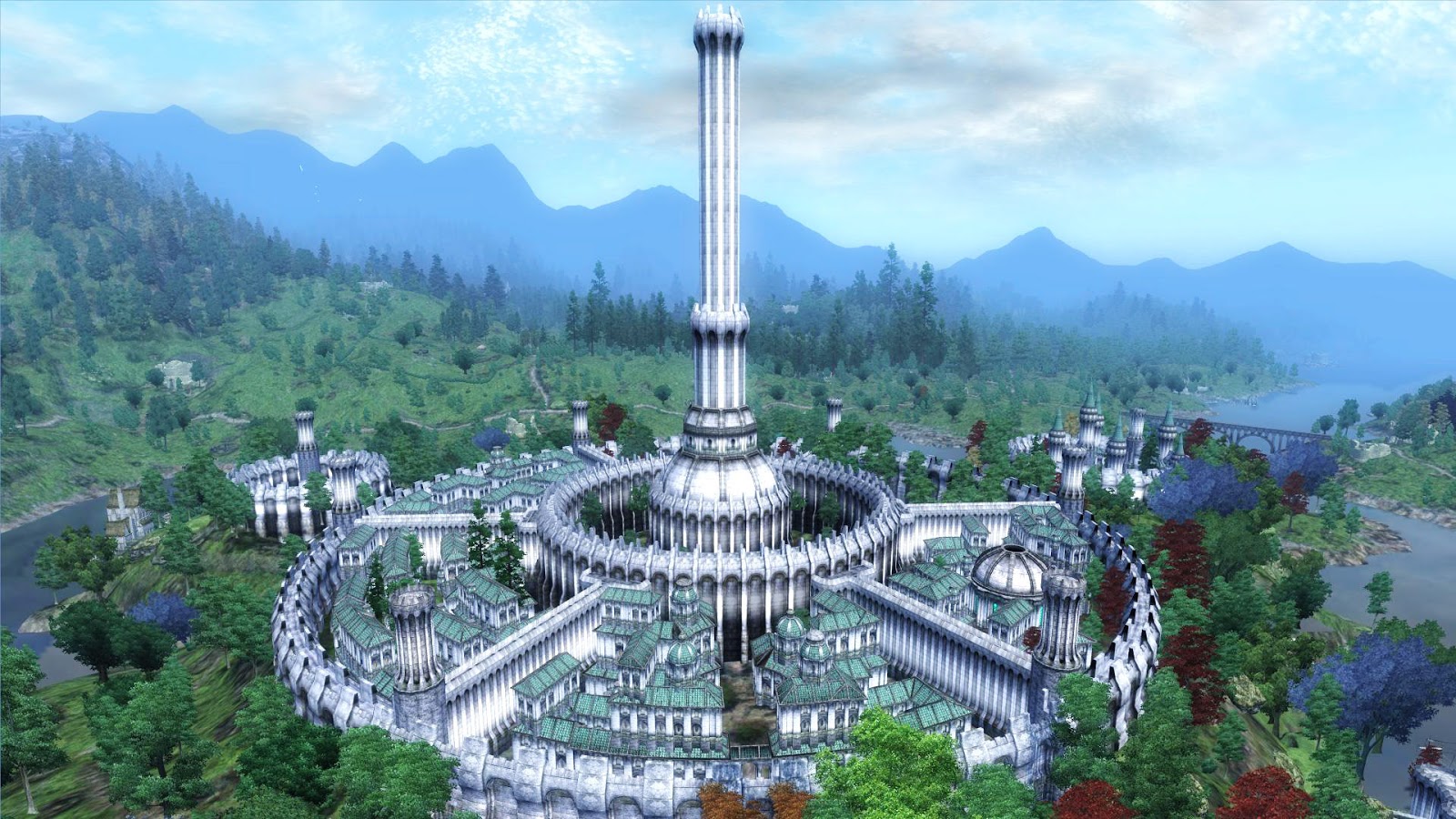
Cyrodill Imperial city ( Elder Scrolls )

Minas Tirith (Lord of the rings)

Winterfell ( Game of thrones )
The influences from these 3 castles can be seen clearly in various elements of ours, which both me and Liam were very happy with, as it not only matches the 3D layout really well (which in turns helps with consistency in later shots of the castle from different angles), but certainly gives off that towering feel of castle without it necessarily looking too menacing or exaggerated. ( And as a bonus, its giving a nod to all my favourite fantasy series as well). Another point to point out, for the first background below, I set the resolution substantially higher than the rest. Reason being, as mentioned in the above section, the key asset of this shot ( which was the castle) was intended to being reusable in following shot as well, hence the need for a workable high resolution for close ups or wider shots. ( As well as highlighting another benefit of sticking close to the 3D map).

Apart from the castle itself, the rest of the elements that constituted the first background above ( the bridge, the sky and the mountains) demanded a bit less "design" but more in terms of texturing. the Bridge itself was quite simple, with a straight forward brick design, and had a lot more focus on lighting and colouring to make it stand out. The mountain and the sky however, took a bit while as I wanted to make them sort of semi realistic looking, as to retain the feeling of grandeur with it conflicting with the animation and the castle too much. In doing this, I was channeling a very particular source of inspiration in the form of Bob Ross and his painting technique.

Overall I was really happy with how the result came out, as it ticked all the requirements that I have listed above. If there is one thing that I would have like to change in this first backgrounds, it was the lighting on the bridge and castle, as I found out later that it was much more prominent. However, we couldn't do much to fix it, as it involved too much destruction of the details that I've worked very hard on so both me and Liam were happy to leave it as it is.
In the following backgrounds you can see how elements of the first background was re-used


The shot above was a blow up of the castle from the first bg.


This shot of the profile of the brick wall of the bridge was another prime example of reusable assets, for this particular case, is the brick texturing the of the wall, which as seen in some of the below backgrounds, is cropped out, morphed and laid on top of the 3D render to create new shots.


These final shots below, along with the very first background are what me and Liam dubbed " money" shots - those that had the most work put into them, and as result , looked the best out of all the shots. This can be attributed to fact that these shot contained the most environmental elements, mainly the mountain range, the sky and the sea, which demanded much more custom works. I am very much proud of these particular backgrounds.


more of that Bob Ross showing through

No comments:
Post a Comment