Thursday, March 14, 2019

LAUAN603 : Big project #1 : Liam - 4

My last role in the whole Extended practice module, I went back to help Liam Wilson with his live action project, which during the period that I was working with Sheville, he has finished filming and is in the final stages of VFX and composition. As a part of that process, I'm to help him design a futuristic city that can be drawn and inserted into the background. We began with this mood board below


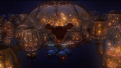
The general concept is a furtistic domed-city. In particular, Liam's was influenced by the underwater city of the Gungans from Starwar, while I was instantly reminded of the Dome plantations of Darling in the Franxx

Darling in the Franxx

Star wars. 

On the key point of the concept that Liam wanted was the "dome" being made up of interlocking beams that form in between angular negative spaces that is similar in shape to those on the outer panels of the drone design I had done earlier (as the drones are manufactured inside that city). These spaces would then be filled by a force fields that "complete" the dome ( in a very similar manner to the Gungan's shield in the mood board above.


. Using that instruction and my inspirations , I quickly got out this simple sketch of what the city could look like 


Drone design for reference. 


At first , seeing how the drones were the main antagonist of the movie, I presumed the city would have quite a classical "menacing design as well, represented by the sharp angular beams that surrounded the city, along with the irregularity of the shape of the dome, which made the whole thing having a very "biomechanical" look to it ( like an insect nest almost, which in my mind compliments the idea of the drones being launched from it). I was also very fond of the alternate design of the dome's pattern and the the taller beams outside - which had a much more artificial feel to it. 

However, as it turns out, Liam didn't wanted the city to looking menacing, but in fact, more clean and more utopian-like, so as a result , I scraped the whole thing apart from the side view shot I had, which I cleaned up and did some colour adjustment to create the base look for the new city. From there, it was a simple process of refining the little details toward the final illustration, which included thinning the dome beams down, cleaning up the base of the dome, refining the skyline inside and changing the dome's colour to a more sky blue tone. 


final illustration. 


As part of the refinement process, I did some testing shots with the city inserted into the intended background as well. Naturally, the base city with it colour scheme would stand out way too much in the desaturated palette of the shot. 


This of course led to what I would consider the most challenging aspect of the entire process - adjusting the city to fit the background. This was broken down to 2 areas - adjusting the angle that the city is drawn in ( the shot is from a top a rolling hill looking down toward a valley where the city is located , therefore it should have a slight angle to it) , and adjusting the colour settings to match the environment. Luckily, we didn't have much problem with the texturing aspect due to the distance of the city in the shot as one fear that I had was that the painted look of the illustration wouldn't be able to match the detail of the live action background. And so, the 2 main problems were tackled and the final tests shots that I made came out looking not half bad at all, even if I do say so myself. 


Being my very first attempt at combining illustrated assets in real life, I say this had provided me with a lot of useful knowledge, particularly in the colour settings of the Photoshop and Clip Studio which undoubtedly would prove useful for me in the future. As for Liam, he was really happy with the test, as it provided him a good frame of reference to do his own adjustments as well. A very good end to my final extended project.




Monday, March 11, 2019

LAUAN603 Big project : Liam Sheville - Autumn Bridge


Another project I decided to participate in was Liam's final film - " The Autumn bridge ", which from what I have gathered from the script and storyboards, portrays a "Revenge of the Sith" like duel between 2 knights. My role for this remains the same from when I was with Chloe - being the main background artist, and in charge of everything from the castle's design to the colour pallete for the animation and everything in between. What sets this apart from Chloe's though, is the sheer quality that these background needs, as it involves lots of large, cinematic shots, that contain complex elements such as the sky, mountain ranges, water bodies, ( all of which need a certain level of detail to capture the more moody and serious tones of the animation ). With that said, we started the process in the same manners as Chloe - building a 3D layout world for Liam to capture his storyboard frame from. Having experienced the ease that came with having a 3D render laid out for you to colour on top from doing Chloe's background, I was very much inclined to replicate the same effect with Liam's. And so, the first couple of days was just waiting for him to finish with that, as well as adjusting the storyboard themselves in a way that we can res-use some complex assets in multiple shot (this will be highlighted better down below).


Following that, the next challenge was designing the castle. I was very much interested in the rounded shapes of the 3D form that Liam had made for the layout, but it definitely calls for a bit more variety and texture to make it more "intimidating" and "grand" , as a castle should be. For that , I found major influences in popular fantasy castle designs that have a similar construction namely : 


Cyrodill Imperial city ( Elder Scrolls ) 


Minas Tirith (Lord of the rings) 


Winterfell ( Game of thrones ) 

The influences from these 3 castles can be seen clearly in various elements of ours, which both me and Liam were very happy with, as it not only matches the 3D layout really well (which in turns helps with consistency in later shots of the castle from different angles), but certainly gives off that towering feel of castle without it necessarily looking too menacing or exaggerated. ( And as a bonus, its giving a nod to all my favourite fantasy series as well). Another point to point out, for the first background below,  I set the resolution substantially higher than the rest. Reason being, as mentioned in the above section, the key asset of this shot ( which was the castle) was intended to being reusable in following shot as well, hence the need for a workable high resolution for close ups or wider shots. ( As well as highlighting another benefit of sticking close to the 3D map). 


Apart from the castle itself, the rest of the elements that constituted the first background above ( the bridge, the sky and the mountains) demanded a bit less "design" but more in terms of texturing. the Bridge itself was quite simple, with a straight forward brick design, and had a lot more focus on lighting and colouring to make it stand out. The mountain and the sky however, took a bit while as I wanted to make them sort of semi realistic looking, as to retain the feeling of grandeur with it conflicting with the animation and the castle too much. In doing this, I was channeling a very particular source of inspiration in the form of Bob Ross and his painting technique. 


Overall I was really happy with how the result came out, as it ticked all the requirements that I have listed above. If there is one thing that I would have like to change in this first backgrounds, it was the lighting on the bridge and castle, as I found out later that it was much more prominent. However, we couldn't do much to fix it, as it involved too much destruction of the details that I've worked very hard on so both me and Liam were happy to leave it as it is. 

In the following backgrounds you can see how elements of the first background was re-used 


The shot above was a blow up of the castle from the first bg.


This shot of the profile of the brick wall of the bridge was another prime example of reusable assets, for this particular case, is the brick texturing the of the wall, which as seen in some of  the below backgrounds, is cropped out, morphed and laid on top of the 3D render to create new shots. 


These final shots below, along with the very first background are what me and Liam dubbed " money" shots - those that had the most work put into them, and as result , looked the best out of all the shots. This can be attributed to fact that these shot contained the most environmental elements, mainly the mountain range, the sky and the sea, which demanded much more custom works. I am very much proud of these particular backgrounds. 


more of that Bob Ross showing through


Overall this entire project has been very fulfilling for me. It was certain a good practice for me in the concept art-style of illustration, and the ways to create render natural elements. But more than anything, it was really a lesson in efficiency, of how you can use 3D layouts, recycled assets and smart planning to really increase your production rate while still keeping a certain level of quality. It is certainly going to influence my entire approach to doing backgrounds going forward.

Monday, March 4, 2019

LAUAN603 : Live Brief - 4 : Yostar

My final life brief choice was another collaboration with Yostar games for their IP Azur Lane. This time, its a commission for the opening of their official Instagram account


While the actual drawing of this brief was quite straight forward much as any other illustration in the past, much of the challenges lied in the sketching and composition stages in the beginning, which stems from the specific requirements that was attached to this commission.

First thing was that it was intended for Instagram, therefore, the illustration would have to fit in the square ratio of the Instagram's display. For me in particular, having been used to the wide-shot, cinematic looking ratio for my illustrations, I found it to be very crammed, especially when you trying to show off each of the character's design as much as possible. Which bring us to the 2nd major point of this commission.


As listed in the image above, it was to describe the 4 girls together taking a group selfie. This means, that there would be a lot of playing around with the posing , perspective, the emotions displayed on each of the characters... It has to make sense from position perspective while keeping it natural and fun and shows the personality of the characters ( who are the main highlights of this illustration ). Another point was also to highlight their outfit design ( which is another major draw-in factor for the audience) which ties us back to the first point regarding the limited space of the grid ratio, which when combined with "taking a selfie" pov, as seen down below, doesn't leave much space to show off each individual in the picture.


However, after playing around with different variations, I found that high-angle shots such as below provided the best field of view for the characters. And using that as a base, I managed to came up with a composition sketch that both me and the Yostar team was happy with.


Having done away with the trickiest bits the rest of the process was very efficient and clear. The most notable thing during this stage was probably deciding on the outfit design, with the main theme of "casual and modern in mind". I also take into account of each character's bio when choosing the outfit as well, in regards to their origin and personality such as, Prinz Eugen (the far left character) being German - and therefore having the Iron-cross necklace and gothic-influenced clothings, Enterprise ( next to Prinz,) wearing a US navy-style military cap combined with a much more cool and hip-hop look to her outfit while Belfast and Hood ( both are British) , both have a more refined form of casual clothing. 

                                                                                  Prinz Eugen outfit influences 


Final grayscale sketch prior to colouring 


Overall I was very happy with the outcome of this brief. The requirements certainly gave me a good challenge to overcome, as well as being a good practice in perspective shots and outfit design for me and of course, a gain in publicity and my own confidence in working professional projects. A very fulfilling result !