Thursday, February 14, 2019

LAUAN603: Live Brief #3 : Character design challenge -

For the third live brief, I went back to my roots of character designs by participating in the CDC - Character design challenge for the Character design quarterly zine. The theme for this month was caveman, which was certainly a topic that I've never considered up until that point, so I was very much intrigued in seeing how it would turn out.

For me in particular, the "caveman"character instantly connected me to a large, bulky and powerful form, partly from my own perception on how your surrounding environments would shape you as a living being ( in this case, a harsh and dangerous world of prehistoric earth would create harsh and intimidating humans), but also from the fact that in popular character traits, a large buffed figure often signifies a less "sophisticated" mind, which is something a caveman certainly would be compared to us modern humans. Also, the caveman in my head was a warrior, therefore having an intimidating form certainly would fit the motif as well. The result is the variations of body type below. 


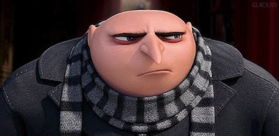
influenced by Gru's slouching form and Ralph's blocky limbs 

Out of all of them, my favourites were 3 5 and 6, due to the feeling of a "lumbering tank" that they possess. 4 and its inverted triangle body shape in particular I felt was too buffed in a body-building type of way instead of just pure power and force (which makes it more fitting for a superhero character in my mind). All that was left was to find the middle point between my top 3 to find the right figure for my caveman, which I did manage to accomplished later on in the final sketch.                         
After that I moved on to do some variation test on the head. This is an area where I had to do a lot of a balancing between real life traits of cavemen and my own artistic judgement in order to create something that is believable but also set it apart from the rest. The general characteristic that I wanted to adhere to real life were the smaller skull's height in proportion to the face, the large nose and the overall rugged and defined surface of the face in general (refer to the examples below). I felt those are the characteristic that are really key to portraying the "early human" appearance. Asides from that, I was pretty loose with my interpretation, particularly in the realm of facial hair, since if I were to stick to real life references, my caveman would just be covered in it, in my mind , making him look pretty generic. Artistic interpretation were also the core factor for the scars and accessories tests as well, with the case of the sabertooth skull helmet both a creative measure to emphasise the caveman's warrior nature, as well as another identifiable cues about the period he's living in and that in fact he IS a caveman.


Final sketches.


All that was left was to put the head on to the chosen body type. For the clothing choices, I have certainly prepped my caveman for a colder environments than others (which make sense with the post Ice age environments and all), with the addition of the fur present through out. Finally, the mammoth's tusk club serves the same function as the sabertooth helm. With the final sketch done, all that was left was to finish the illustration. 


Overall I was extremely happy with the result of this process, as it fits with all my intended criteria while being something so different from the style that I was familiar with. In completing this challenge, I felt that I've gained much more experience making more diverse character design, as well as the improving on the technical artistic skills in the realm of anatomy, colouring and texturing. Certainly one of the most fulfilling results I've had. 


Tuesday, February 5, 2019

LAUAN603 : Big project: Chloe

Continuing on my illustration-focused path, I team up with Chloe and her group for their animation about the "Shadow man" with a role of background artist. As a result, it was a small period of waiting for them to gradually sort out the story, character design and most relevant to me, the storyboard as it would determine what and how much do I draw. When the storyboard was completed, we had a group meeting where it was determined that I would have a total amount 13 different shots to draw, within 2 different environment, the bedroom (which is 90% of the play time) and the classroom. Although with my role being the support artist and not the director, I did add in some of my own opinion onto both the storyboards and character designs to help brings everything together a bit better, especially in the realm of colour, lighting and shot compositing (all the while being mindful that it is not MY project to take charge of course) .


 I think that was the main highlighted challenge of this project - negotiating with my peers and adjusting my art to their needs in order to deliver the best product as possible. If anything it is a very realistic simulation of a professional working relationship and serves as fantastic practical experience. And in the end, I finished my role very efficiently and with all the other member happy with the stuff I provided so that's a very encouraging thing to hear. But not to jump the gun just yet, going back to doing the background themselves.


We started of with this moodboard for the type of furniture and decoration :


After that me and Chloe worked out a 3D mapping of the room, which later on she used as a platform to construct the shot for me to do the background from, which later on proved extremely helpful in getting the background done quicker.


After all the set up were in place, it was just the case of doing it : 


examples of background and 3D model 


For the style of background, I use a combination the character design as base (which is very animated ) mix with a touch of realism ( in the forms of the realistic perspective, lighting and details). I found this style works really well as it can accommodate a more diverse range of characters style while still retaining that level of realism that helps the horror aspect to feel more substantial. ( this style has proven its effectiveness with my Loop di Loop brief as well). Colour choice is also another thing I was mindful about. Taking inspiration from Insidious and the Conjuring series


Desaturated and limited colours

I specifically chose a less saturated colour scheme for each of the environments to help envoke the dreariness that the characters experience throughout the entire movie. In the case of the night scenes in the bedroom, it was further pushed with the use of low lighting and less contrasting colours, which would help to highlight the dark mass of the shadow when he comes on. (Also working from the idea that what we don't see scares us even more).

All in all very happy with what I have accomplished. I think the next step now for me would to provide support for them later on in compositing the animation into the backgrounds as well as some post production effects and colour adjustment which I always look forward to be of service.