Wednesday, November 30, 2016

OUAN404 : Captain character (III)

Finalising my designs ! :


Absolutely love the final design I came up with. The balance of colour distribution works very well with the more striking colour being at the top and below. As for the colour choice itself, I definitely used some of my trivial anime logic about the meaning of hair colours ( red here is typical of the tsundere-type character , one who seems brass, passionate and sometime hostile towards other but more than often would show their soft sides) . The Bumblebee combination of black and yellow really gives a 50s like diner vibe, which contrast very well to the blue pants , plus the added oil marks really give personality to the character. I also quite enjoy the pattern design on the hat and apron , but to be honest , it seems like if we are to animate it , it would be very difficult to replicate. About the process itself, drawing and colouring really came off as a natural instinct for me thanks to my digital art back ground, and the early sketches of the design in the sketch book really helps identify the volume of each accessories on the character. Overall , a very satisfying work , if I do say so myself.

Poses : 

Notes*: Really tried to create pose that gives of that sense of activeness, lightness and care-free attitude that is crucial to her personality


Tuesday, November 29, 2016

OUAN404 : Captain Character part II :

More design done for character ! :


For the hairstyle , keeping the same style as the body shape ( angular and pointy ) , I lean toward the more funky and messy hairstyles, some even boyish-looking to really indicate her hyperactive and bash attitude. Among them , I like the one with the beanie hat thing the best , as its inspired from a kitchen cap , combined with a regular beanie to create something that seems normal to be a every-day accessory but also identify what her position is ( a kitchen staff and waitress ) . The fact that even though a cap is supposed to covered your entire hair (so it won start falling off all over ) , yet her hair still pops out reinforce the idea of her being a slob at times. 

  
*Insert CAP-tion*


the many examples of waitress outfit , I definitely preferred the more tomboy-ish and casual look of the far left , as in this context , Marie is working at a family-run chip shop , so there is no need for proper uniform , and that is not mentioning her personality yet. However , the appeal of a dress plus apron is very alluring indeed !

  
The mechanic suit idea is actually pretty straight forward ,as it is such a recognisable image. On top of that , I didn't to over-sexualised the character by doing short shorts or rolled and tied shirt cow-girl style , so I tried with a very typical mechanic out fit , with the added goggles for the extra flair

The outfit design follow the general principles above. I tried to combine the "apron" ( waitress ) with a mechanic suit , as portraying her hobby of being in the garage constantly , and coming in the shop straight from it ( the oil marks really help with that !) . I think that would create a very unique look that identify with her personalities well . Preference is leaning for the first outfit ( middle page , far-left design) 

digital combination concepts !

On the side note , really love working digitally like this . It's probably because I'm so use to doing thing digitally that I found the concepts here seems much more appealing than the one in the sketchbook 


Wednesday, November 23, 2016

OUAN404 : Study task : Captain character

My character is Marie , a  waitress at a chip shop , set in a cyberpunk-like future where aliens live among us. She also has a major interest in mechanic and building thing, which would make her go into the workshop every free chance she gets , even during break hours. She's energetic, and fun-loving , but also a bit of a slob , and can have a feisty attitude , even towards customers ( who deserves it to be fair ).

Since that is her character , I build up her design to resembled a very teenage-like girl , with the shape consisting of mostly triangles , since from what I have learned, in character design, triangles can often represent speed and agility ( like sonic the hedgehog perhaps ) , and in turn a personality that is close to what I have in mind.


examples of using shapes in character construction 

Up

The shape is very in line with the character's personality , Carl being defined by squares  for his stubborn and conservative nature , while Russell being cute ,huggable and out there , is define by soft rounded shapes


Most of the element in my character design choices has heavy influenced from anime design , that being the slender figure and large head with a v-line face . With in the 2 designs above , I'd prefer the left in terms of the leg shape , as the more slender leg and small feet give more of a sense of lightness for the character , and had a more stream-line look to it . Moreover , the leading factor in the character would be her hip , with her back arched back and chest puffed out in most case , again , to portray that level of confidence 


For her head however , I wanted a bit of softness, just to increase that level of cuteness and adorability to make her more appealing , hence learning the classic anime tropes of big eyes , big heads and small nose and mouth ( eyes are the window to the soul, so it definitely would also help with portraying emotions later on 


I tried playing around with a large dress idea and the dynamics of it in simple shapes. However , the dress probably wouldn't fit her personality that well. On the side note , anime influence is demonstrated clearly in eye shapes. The strong thick eyebrows is really calling out to me , as it seems much more expressive .


alot of inspiration were taken form trainer designs from Pokemon , which utilise anime elements 


Tuesday, November 22, 2016

Environmental stories - background analysis : Phantom boy


After Spirited Away representing Eastern animation and Aladdin for the American style, It's only appropriate that we would move to the middle point between the two styles , metaphorically and literally : European animation , with Phantom boy , the newly presented French animation. Jumping straight to the point , the background of course does not compete , detail-wise , with neither Spirited away nor Aladdin , as it is done in a completely different style and method that requires less details and intricacy , that is being done digitally and using vector-shading. Of course , this is done to fit the whole style of animation the team was striving for , and in that sense , it had done so very effectively. 


First thing to mentioned , that the style really fits with the tone of the narrative - a light-hearted comedy with the face of crime drama ( at least it is that way in my mind ) .This is supported by the wacky building design, making windows of skyscrapers seems a collection of mosaic block , with lots of bright colours used through out the entire scene that make its seems like a collection of mosaic blocks, all together create a very light and uplifting tone for the story , even in the more serious scene, whether that is good or not.


For the scene above , the colours in my mind works very in a logical sense. It create very unique visual quality ( and that can be said for the entire movie ) , using bright and contrasting colours , and along side that , actually describe autumn very effectively , with the image of the yellowing leaves and the sense of a  cool temperature, coming off from the greens and yellows of the grass and the character's clothing . Fit together , it create a strangely contrasting but calming colour schemes , which gives of that mood of the character finally having a break at the end of the movie.


On the other hand, the Phantom boy , simple as it may seems , can actually have very detailed and intricate scenery like the one above, describing a 70s like New York that is alive and vibrant , taking advantage of billboard and signs to add colours to what can be described at rather "bland" buildings and towers. More over that sense of depth and scale really helps with portraying  the character to be flying high above, but not reaching over it yet ,emphasising on the grand scale of New York.

Environmental stories - background analysis : Aladdin

Here are some of the visual development art that were used for Aladdin :


Contrasting to the realism of Spirited away and other anime backgrounds, the ones for Aladdin ( also many other Western animation ) takes advantage on stylisation and exaggeration as a tool to deliver the fantasy element of the story. That of course make it less intricate and detailed than those of anime , however , that does not mean it is lacking in any sense, as demonstrated by the  art above, and of course , its succeeds in what it is designed to do. For example, the exaggeration of the size of the palace compared to other helps with the emphasis on power and authority for it, or the size of the rock entrance to push the idea of a significant present in the vastness of the desert. However , the enlarged domes of the architecture, does sometime feels like an over-done attempt on portraying other culture ( Islamic architecture ) , as contrary to the natural and subtleness of Japanese anime ( although to be fair , they are describing their own culture ).


One other point that is very interesting , is that in these art works , there's seems to be a focus on a specific palette for each scenery , such as , shades of blue for the night scene above , or the red and orange and white of the magma below, and it most of it make use of high level of contrast in each scenes. This is done with great effect, as it really helps to identified the mood of the story in each scene, like a calm , quietness of the Arabian night , with the extremely darken shades adds to that sense of mystery. Along that line, the magma picture below screams out intensity and rage , thanks to the pure white adding a luminous quality to the lava itself . Add that with the heavily contrasted rocks at the bottom makes it almost seems blindingly bright , which really add to the overall emotional impact of the scene - that sense of danger and urgency
   

Monday, November 21, 2016

OUAN404 : Visual Language : Environmental stories ( updates )

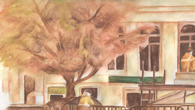
After as selection of pen and art-liner drawing , I decided to add some more colours into my environments. In my outside illustration works, I've always had an interest in warmer shades of colours , which often brings out a sense of closeness, tenderness and passion, as opposed to the distant and coldness of the blues and green. Which its why I found it pretty ironic to see autumn in the UK , a season that is define by warm shades to be surround by cold and bitterness ( my GOD it is cold). However , it didn't stop me trying some stuff out with those shades, and the products that followed looked really interesting. ( the watercolour texture really gave that sense of mysteriousness , almost a dream- like vision of the real scenery)


Saturday, November 19, 2016

OUAN403 : Animation skill : test

Following the Animate it study task, I decided to produce a short animation gif to further experiment with 2D animation , in this is its a samurai drawing his sword. I have to say , the more I do this the more I feel that the straight-ahead form of animation fits me best , as it allows me to be much more flexible and creative in creating motion, especially ones that are complex like the drawing and sheathing of sword of a samurai (which on the latter I failed to do actual, as it is missing the sliding of the blade along the sheath before actually putting it in - which will be a quite confusing description for people who don't know how that works ) :


Animation-wise though , I'm actually quite please with it . the action is clear and shows a decent amount of fluidity ( agains thanks to straight-ahead animation ) even is the lines is constantly moving out of place ( boiling point style ). I'm also please to see that I have gained some level of understanding speed in animation , as the swift draw of the blade is exactly what I want to portray.To that end , what I would want to improve on it is first , like mentioned above is to produce a more correction representation of the action to real life and second , is having more movement variation is the different sections of body and armor , by doing so show that they are individual pieces that doesn't stick to the body but follows it , creating a more lively character and more realistic movement