Showing posts with label LAUAN603-Portfolio. Show all posts

Monday, March 4, 2019

LAUAN603 : Live Brief - 4 : Yostar

My final life brief choice was another collaboration with Yostar games for their IP Azur Lane. This time, its a commission for the opening of their official Instagram account


While the actual drawing of this brief was quite straight forward much as any other illustration in the past, much of the challenges lied in the sketching and composition stages in the beginning, which stems from the specific requirements that was attached to this commission.

First thing was that it was intended for Instagram, therefore, the illustration would have to fit in the square ratio of the Instagram's display. For me in particular, having been used to the wide-shot, cinematic looking ratio for my illustrations, I found it to be very crammed, especially when you trying to show off each of the character's design as much as possible. Which bring us to the 2nd major point of this commission.


As listed in the image above, it was to describe the 4 girls together taking a group selfie. This means, that there would be a lot of playing around with the posing , perspective, the emotions displayed on each of the characters... It has to make sense from position perspective while keeping it natural and fun and shows the personality of the characters ( who are the main highlights of this illustration ). Another point was also to highlight their outfit design ( which is another major draw-in factor for the audience) which ties us back to the first point regarding the limited space of the grid ratio, which when combined with "taking a selfie" pov, as seen down below, doesn't leave much space to show off each individual in the picture.


However, after playing around with different variations, I found that high-angle shots such as below provided the best field of view for the characters. And using that as a base, I managed to came up with a composition sketch that both me and the Yostar team was happy with.


Having done away with the trickiest bits the rest of the process was very efficient and clear. The most notable thing during this stage was probably deciding on the outfit design, with the main theme of "casual and modern in mind". I also take into account of each character's bio when choosing the outfit as well, in regards to their origin and personality such as, Prinz Eugen (the far left character) being German - and therefore having the Iron-cross necklace and gothic-influenced clothings, Enterprise ( next to Prinz,) wearing a US navy-style military cap combined with a much more cool and hip-hop look to her outfit while Belfast and Hood ( both are British) , both have a more refined form of casual clothing. 

                                                                                  Prinz Eugen outfit influences 


Final grayscale sketch prior to colouring 


Overall I was very happy with the outcome of this brief. The requirements certainly gave me a good challenge to overcome, as well as being a good practice in perspective shots and outfit design for me and of course, a gain in publicity and my own confidence in working professional projects. A very fulfilling result !

Thursday, February 14, 2019

LAUAN603: Live Brief #3 : Character design challenge -

For the third live brief, I went back to my roots of character designs by participating in the CDC - Character design challenge for the Character design quarterly zine. The theme for this month was caveman, which was certainly a topic that I've never considered up until that point, so I was very much intrigued in seeing how it would turn out.

For me in particular, the "caveman"character instantly connected me to a large, bulky and powerful form, partly from my own perception on how your surrounding environments would shape you as a living being ( in this case, a harsh and dangerous world of prehistoric earth would create harsh and intimidating humans), but also from the fact that in popular character traits, a large buffed figure often signifies a less "sophisticated" mind, which is something a caveman certainly would be compared to us modern humans. Also, the caveman in my head was a warrior, therefore having an intimidating form certainly would fit the motif as well. The result is the variations of body type below. 


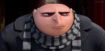
influenced by Gru's slouching form and Ralph's blocky limbs 

Out of all of them, my favourites were 3 5 and 6, due to the feeling of a "lumbering tank" that they possess. 4 and its inverted triangle body shape in particular I felt was too buffed in a body-building type of way instead of just pure power and force (which makes it more fitting for a superhero character in my mind). All that was left was to find the middle point between my top 3 to find the right figure for my caveman, which I did manage to accomplished later on in the final sketch.                         
After that I moved on to do some variation test on the head. This is an area where I had to do a lot of a balancing between real life traits of cavemen and my own artistic judgement in order to create something that is believable but also set it apart from the rest. The general characteristic that I wanted to adhere to real life were the smaller skull's height in proportion to the face, the large nose and the overall rugged and defined surface of the face in general (refer to the examples below). I felt those are the characteristic that are really key to portraying the "early human" appearance. Asides from that, I was pretty loose with my interpretation, particularly in the realm of facial hair, since if I were to stick to real life references, my caveman would just be covered in it, in my mind , making him look pretty generic. Artistic interpretation were also the core factor for the scars and accessories tests as well, with the case of the sabertooth skull helmet both a creative measure to emphasise the caveman's warrior nature, as well as another identifiable cues about the period he's living in and that in fact he IS a caveman.


Final sketches.


All that was left was to put the head on to the chosen body type. For the clothing choices, I have certainly prepped my caveman for a colder environments than others (which make sense with the post Ice age environments and all), with the addition of the fur present through out. Finally, the mammoth's tusk club serves the same function as the sabertooth helm. With the final sketch done, all that was left was to finish the illustration. 


Overall I was extremely happy with the result of this process, as it fits with all my intended criteria while being something so different from the style that I was familiar with. In completing this challenge, I felt that I've gained much more experience making more diverse character design, as well as the improving on the technical artistic skills in the realm of anatomy, colouring and texturing. Certainly one of the most fulfilling results I've had. 


Monday, January 28, 2019

LAUAN603: Live Brief #2 : Loop di Loop 5 - Final animation !


Overall Im really happy with this project, and it certainly had been very exciting challenging myself to finish an animation in 2 weeks. Compared to my very first animation project in Uni where I had 1 month to finish a 10-sec animation, it really showed how much I've improved and that is very satisfying


LAUAN603: Live Brief #2 : Loop di Loop 4

The animation process was as streamlined as it can be, as I decided to not have an line layer for all of the animation. These had two benefits, first being that I can animate much quicker as it took out a whole stage of linework  to do. Second, the animated characters fits much better on to the backgrounds which was done with no out lines as well. As a result of this, every frame I got done feels like a finished frame straight away and required little post production work.

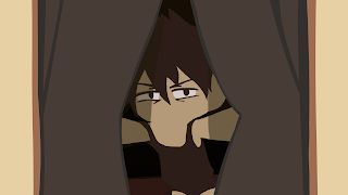
However, on the other had, this method also had it own challenges I had to work through. First thing being, since there are no outlines, I had to have a really good grip on my character model, how each part would look at a particular angle as I had outline to guide me. On top of that, I had to relied on really bold shapes and colour choices to differentiate the different parts of the character, as again, I had no outline to depend on to separate them. This was a particular challenge especially in the first couple of scenes, where there are a lot of overlapping parts in the shot that would "merge" together into large colour chunks and can get confusing if not suggested clearly (example being the image on the right).

Another particular, challenge came in the form of software limitation as well, as the onion skin setting of TV when switch to the two colour mode for the frame before and after, it would automatically fill out the entire character as 1 colour, which erase all the different colour blocks that defined the different section of the character, rendering the onion skin useless. Therefore I had to switch to basic onion skinning which just turn the opacity of the layers down, but of course, it is not as clear as the two colour mode in the differentiation between the before and after layers.


However, I pulled through all of that, basically free-eyeing most of my animation, which turned out not half bad at all and looks exactly like I wanted it to. And as you can see from the frames below, the shots look very polished right away.


The other notable thing was doing the window shot, where I created a multiply effect to use for the shadows of the curtain by using darker colours set on a layer above the animation and just turn the opacity. down. In fact, layering structure and knowledge that I gained from illustration really helped out with making the animation for this as efficient as possible. 


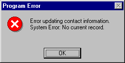
And the final thing, the last scene of the animation was incredibly fun to do, not just because of the "bouncy" and silly animation I used for the icons, but also because I had the chance to play around with the crop copy tool of TV Paint where I replace your brush tip with the image selected, which makes it perfect for doing the glitch effect of the last shot. 


Saturday, January 26, 2019

LAUAN603: Live Brief #2 : Loop di Loop 3

Finished Backgrounds and static shots

Following the guides of the storyboard, I got on to finish my backgrounds for the animation ( of which there's actually not alot of ). The bedroom took the most time to finished as I wanted it to be the most detailed since it is the background that will take up most of the animation. The separated layer of the bedside table and the chair will go on top of the animated characters layer, in order to create more depth in the shot. Besides that, the other thing to mentioned is my clear inspiration from Windows in drawing the laptop screen and the final background, both are based of the iconic Window Xp background. The tricky bit in doing it that was to find the balance between keeping it close to the real one and somehow making it fit with the overall cartoony look of the animation which I think the end result is quite successful in that regard.


LAUAN603: Live Brief #2 : Loop di Loop -2

Finished Storyboard and animatic. I went for a very animated storyboard, as to maximise efficiency for the animating stages


The animatic shows that the idea works relatively well, but I think there could be an improvement on the end bit and how it loops back to the beginning ( the alarm clock might feel a bit to disjointed ). Right now I'm experimenting with some more "error" sounds


LAUAN603: Live Brief #2 : Loop di Loop


For my 2nd live briefs, I've chosen this month Loop di Loop challenge with the theme of Windows. As I only had 2 weeks before the submission date, the whole pre production process would have to be quick in order to get to the animation stage as soon as possible. Luckily I was able to achieved that.

First it was coming up with a narrative. For this, I took a cue from the Loop de Loop page themselves, suggesting that "windows" can also relate to the Microsoft software as well. As a result, I came up with the idea of the endless cycle of digital "nightmare" in the form of a software malfunction that us digital artists and animators are all too familiar with. On top of that, its a homage to the Windows XP OS that have dominated much of my early computer uses ( in the form of all the icons and references used in the story). The aspect of the software being alive used to create a more interesting visual as well as reinforcing the "nightmare" element of the plot.


After that it was a quick process of character design. The core focus was to create a human character that has interesting visual but more importantly, easy to animate. With that in mind, I once again took inspiration from the series Panty and Stocking for my design, with the result being below


With this done , the next thing was to make the storyboard